Pelli: product design for a B2B SaaS built for professional photographers
Designing and evolving a B2B SaaS product that runs the business side of professional photography.
- Role
- Product Designer
- Product
- Pelli
- Duration
- 1 year and 4 months
- Type
- B2B SaaS
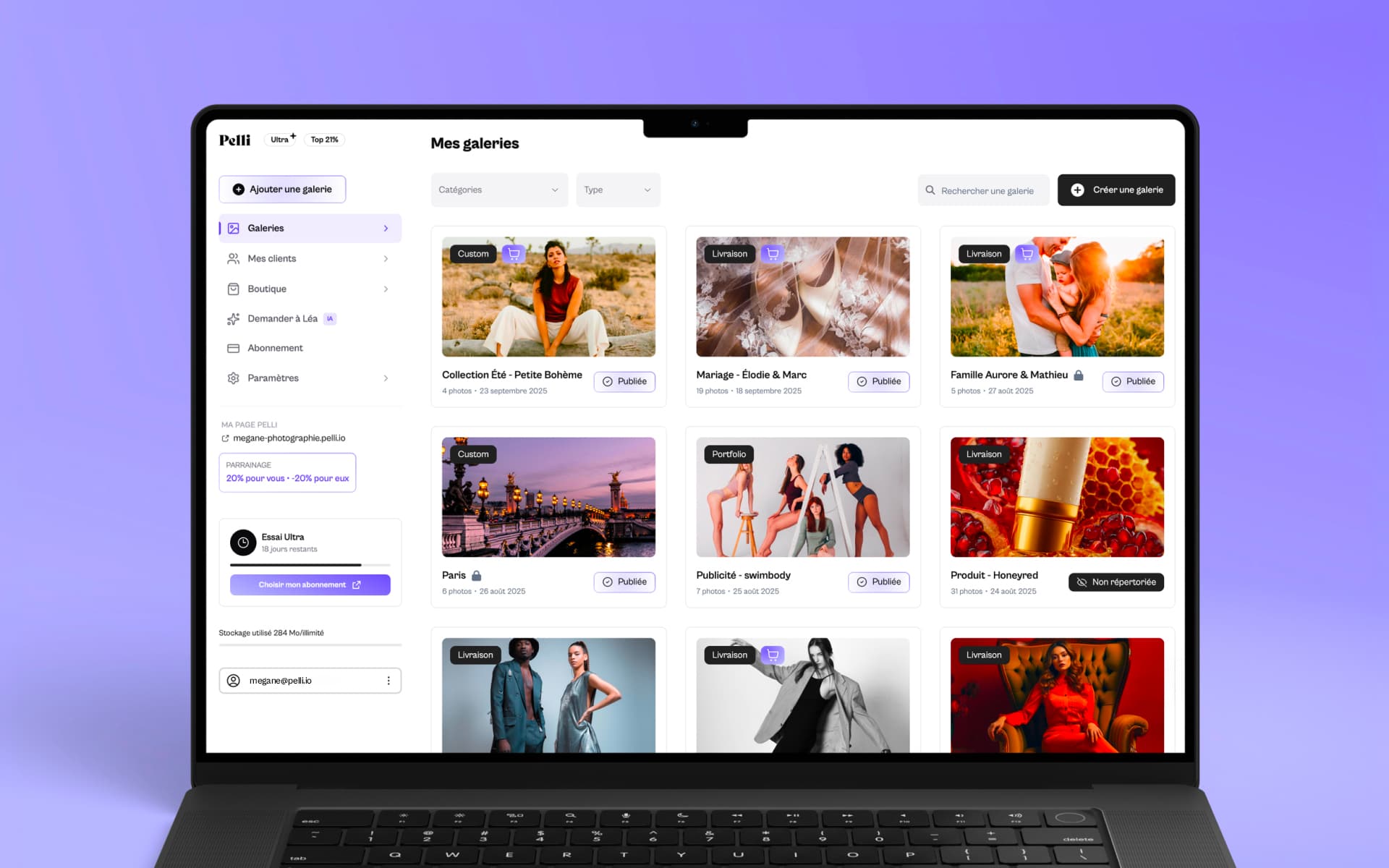
Pelli is a French B2B SaaS product born at Lumy, where the agency builds its own products alongside client work. The platform brings the business side of professional photography into one place, to give photographers their creative time back. I contributed as Product Designer, part-time between client projects, across the whole product.
A rich tool, a creative audience
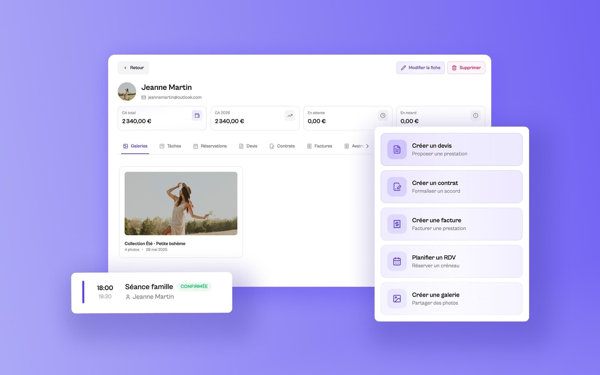
Pelli goes well beyond hosting galleries: it replaces an entire stack of software. Photo delivery and sharing, quotes and invoices compliant with French regulation, contracts signed online, booking, deposit collection, CRM, a public page, marketing. An AI assistant named Léa supports all of it.
Everything I did as a designer follows from that: making a very complete business tool feel obvious.
An unusual working context
Pelli was not a project I worked on full time.
The product moved forward alongside Lumy's client work, inside a small team: the founders, two developers and two designers, myself included.
That called for a lot of pragmatism. We had to spot the improvements with the most impact, weigh user needs against technical constraints and available time, then move in iterations.
We did not always have the resources for a heavily formalised product process, or to measure the precise impact of every change. What we did have was proximity to our users, which let us decide from their feedback and from the problems we saw day to day.
The experience taught me that a good Product Designer does not work in ideal conditions: they also know how to adapt to a small team's constraints and move a product forward with what is available.
My role
I took part in the full product cycle, from spotting problems through to supporting their release.
In practice, I worked on:
- redesigning the interface and improving it continuously;
- finding and removing friction in the user journeys;
- improving content and wording (UX writing);
- user research and interviews with photographers;
- taking part in customer support;
- designing and writing the help centre;
- contributing to backlog prioritisation with the founders;
- daily conversations with developers during implementation.
Being close to every stage let me move past the role of interface designer and take a far more product-oriented approach.
Understanding users before designing
One of the first things I learned on Pelli was how much it matters to talk to users regularly.
I ran several interviews with professional photographers to understand how they work: how they find clients, organise shoots, deliver photos, handle invoicing and chase payments.
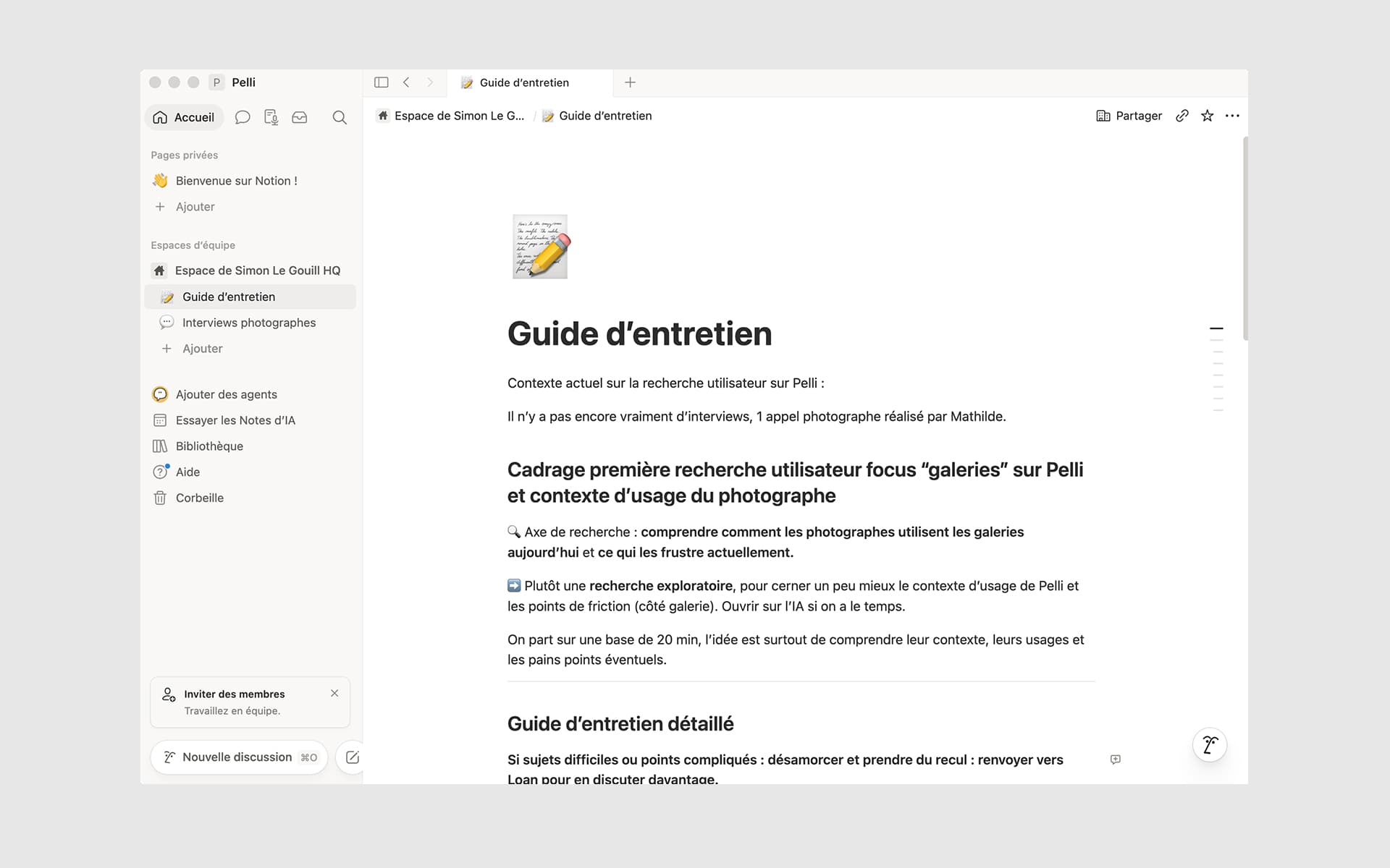
Those conversations were valuable on several fronts.
They surfaced the real irritants in their day, challenged some of our design assumptions, and fed the thinking on where the product should go next.
Some of the interviews also produced editorial content for the Pelli blog. The same conversations therefore fed both the product roadmap and content written for photographers and prospective users.
Support as a source of user research
I also worked on customer support.
That experience changed how I design interfaces, deeply.
Every recurring question pointed at a problem: an unclear journey, an ambiguous label, a feature nobody could find, documentation that fell short.
Instead of treating support as separate from design, I learned to use it as a genuine source of user research.
When the same problem came back several times, it usually became a priority I brought into the product roadmap.
Designing a help centre
Support also made the need for documentation obvious.
I designed the help centre's information architecture, then wrote all of its content.
Articles are organised by theme - getting started, galleries, store, CRM, AI, admin and finance - so that users find their answer quickly.
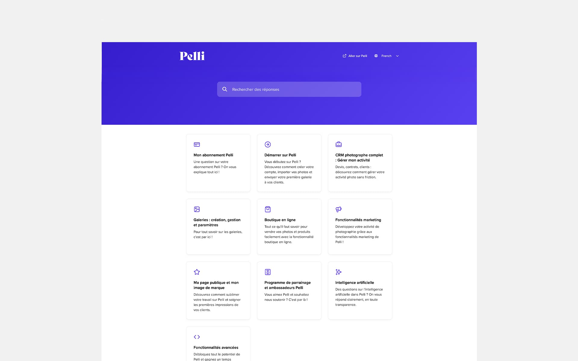
Beyond the documentation itself, the work cut down some of the repetitive requests reaching the team.
It taught me a great deal about UX writing: good documentation often takes as much thought as a good interface.
What this experience taught me
Pelli was my first real immersion inside a B2B SaaS product. I discovered a way of designing through continuous improvement, where every decision moves with user feedback and the team's constraints.
Beyond designing interfaces, I helped qualify and prioritise requests, drawing on user feedback, support tickets and tools like Gleap. I learned to weigh user value against development effort and time, working with the founders and the developers.
Unable to measure the impact of each change, I relied on what I had: what users told us, what support surfaced, what the team observed. That gave me a broader view of the Product Designer's role - beyond the screens, carrying weight in product decisions and constantly looking for the balance between what the product needs and what the team can carry.
Looking back, it is also what makes me want to go further next: to complement that qualitative approach with a sharper quantitative reading, using tools like PostHog, to measure the impact of each product decision more precisely and steer from concrete data.