CINav: the jobs platform for France's maritime industries
Designing a platform that connects certified candidates with employers, in an industry planning 10,000 hires a year for hard-to-fill roles.
- Role
- Product Designer
- Client
- CINav
- Duration
- 10 days
- Type
- Matching platform
CINav is a French national association serving the maritime industries on training, employment and skills. It awards the CCIM, a certificate attesting that someone knows the industry and its trades.
Once certified, candidates had no way of reaching companies, while those companies struggled to fill roles nobody was applying for. The brief: quickly design the MVP of a platform that would connect the two sides and fit the specific needs of the sector.
My role
A fixed-price project, ten days, with CINav owning the platform throughout. I was the only designer on the product, working from the agency side at Lumy.
So most of my work went into deciding what each journey actually had to do - and what it would not do. Designing an MVP in ten days is first of all choosing what to leave out.
Designing an MVP
The project could easily have turned into a job board, but the goal was neither to copy existing platforms nor to ship a complete product straight away. It was to find the simplest version capable of validating the value proposition: letting certified candidates and companies with hard-to-fill roles find each other and make contact.
So I narrowed the scope to the journeys that could not be dropped: account creation, profile management, candidate search, first contact and hiring follow-up. Secondary features were deliberately left out of this first version.
The MVP had to let us test the first use cases, gather feedback, and evolve the product with the client through successive iterations.
Building two distinct experiences
One of the first design decisions was to separate the candidate and recruiter spaces completely.
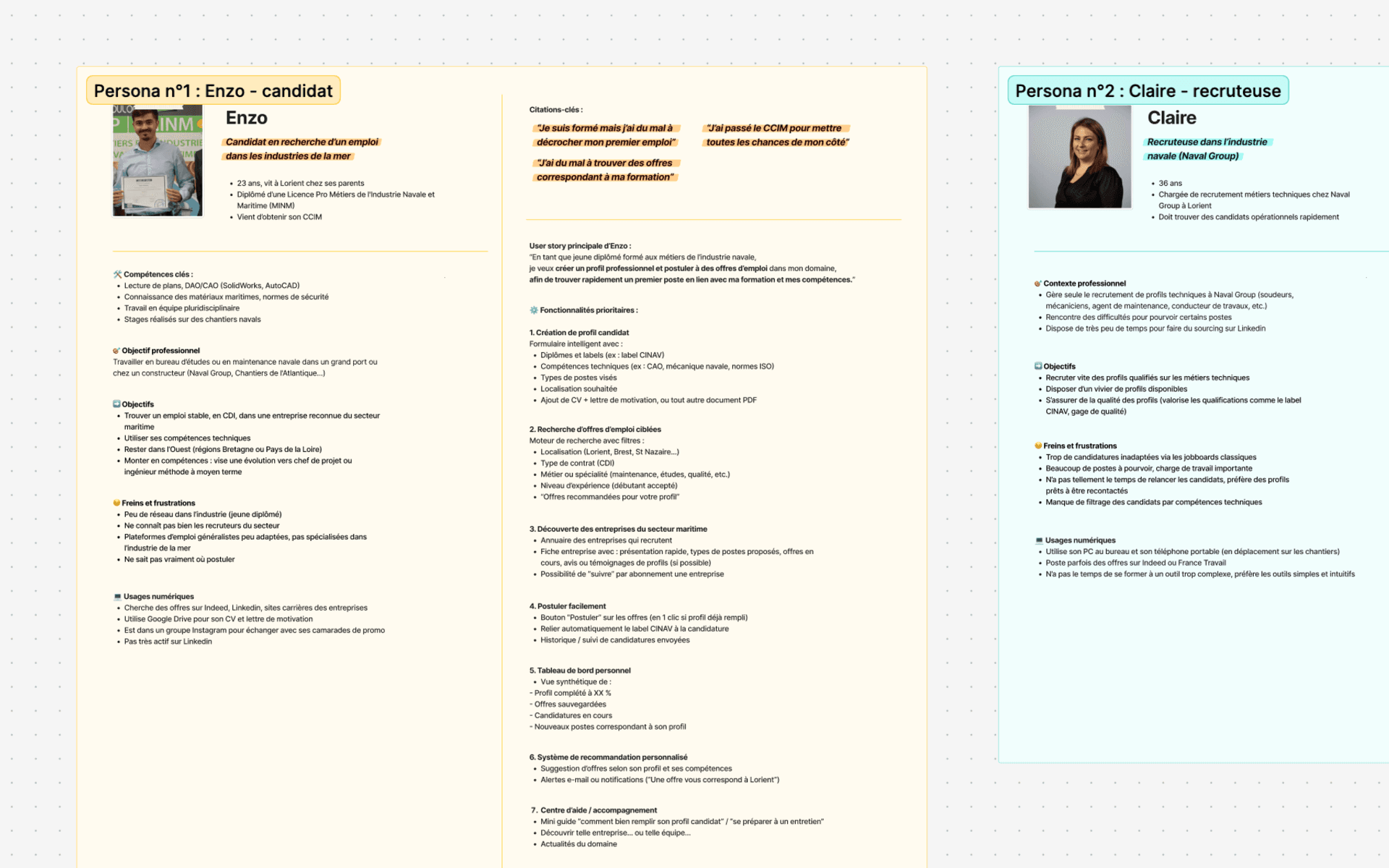
The two profiles are chasing different things. Candidates want a visible profile, fast; recruiters mainly want to spot relevant people and keep track of their hiring.
So I designed two dedicated spaces, each organised around its user's main tasks. That simplified the journeys, kept cognitive load down, and let the vocabulary and the features fit each audience.
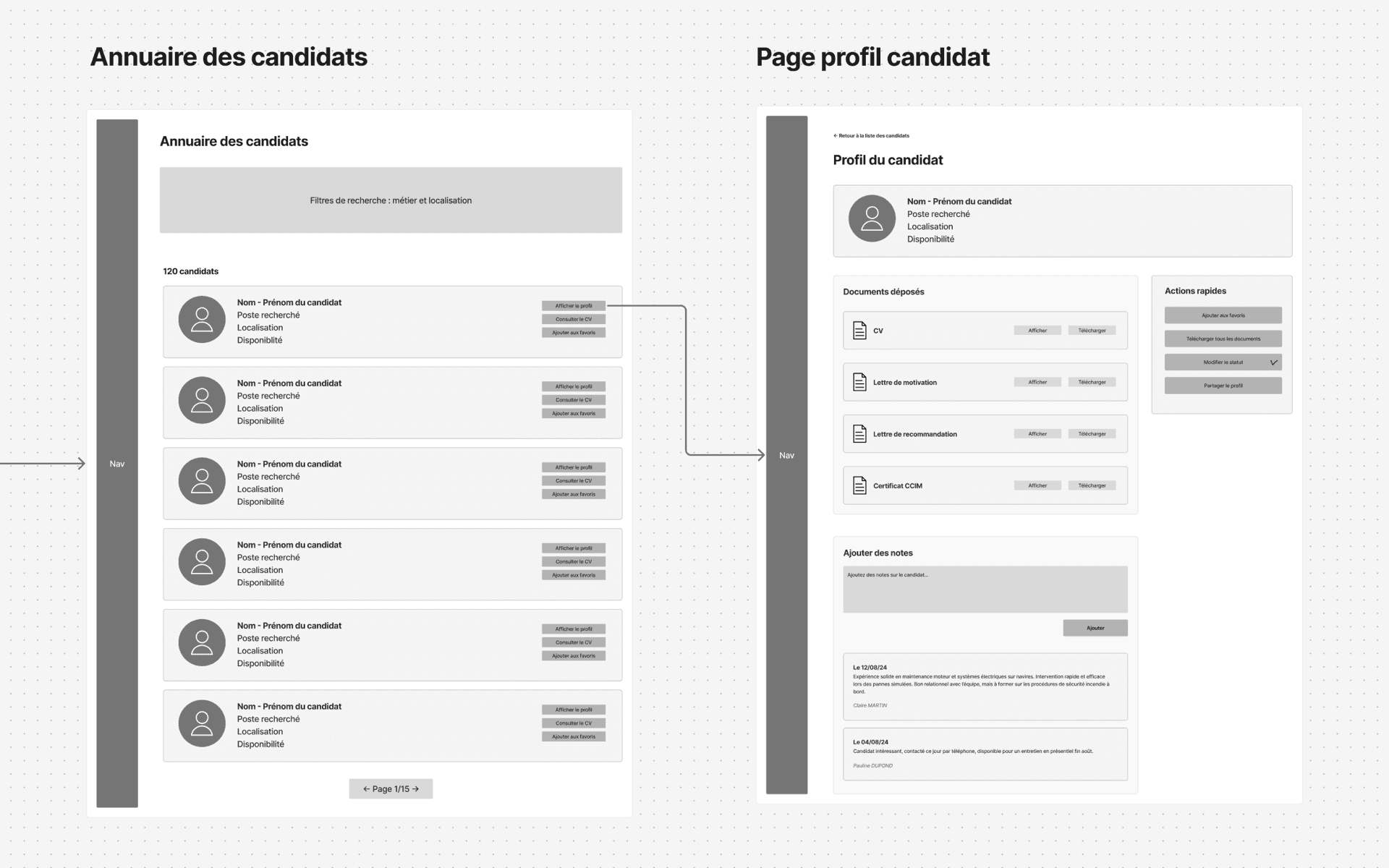
Lowering the effort on the candidate side
CINav had flagged something important: a share of the candidates are not comfortable with digital tools.
I wanted to avoid the blank-page effect, or a long form that would put people off at first login.
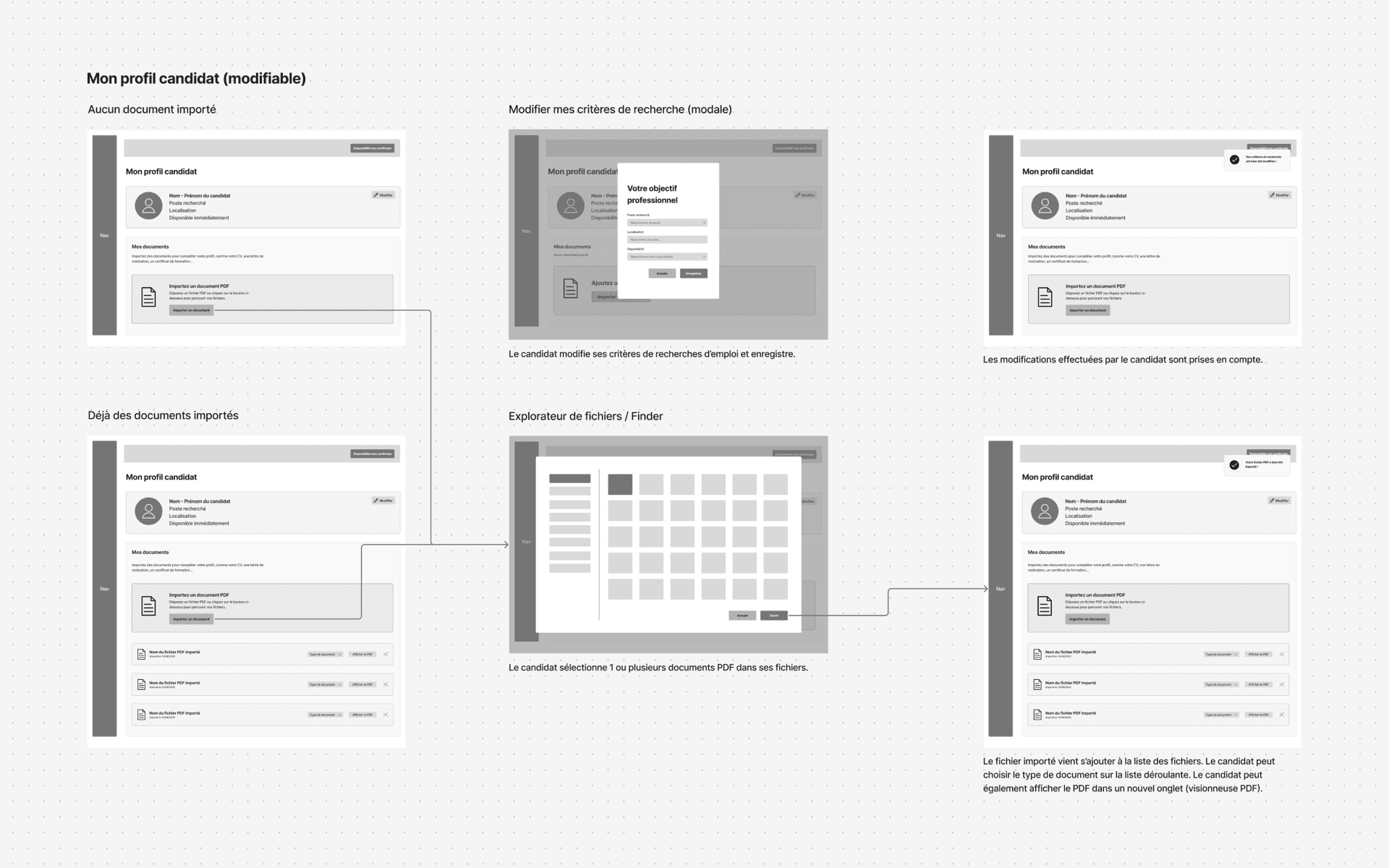
So I designed a guided onboarding that walks candidates through building their profile step by step: upload a CV, add supporting documents, pick the role they want, the contract type, how far they will travel and when they are available.
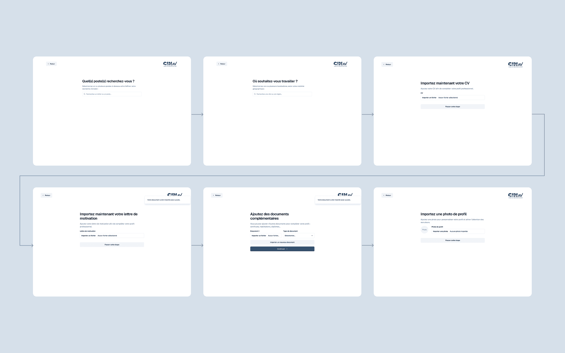
The goal was not just to collect information, but to let every candidate build a profile recruiters can actually use, quickly.
At the end of the flow, the profile is published automatically. Candidates can come back and update it whenever they like, but nothing further is required to stay visible on the platform.
I deliberately kept this space light on features, to keep the experience simple. The product runs on a clear principle: recruiters come to browse the talent pool, not the other way round.
Designing the recruiter space as a working tool
The recruiter journey followed a different logic.
Before reaching the platform, companies describe their hiring needs through a similar onboarding, then CINav approves their account - which guarantees that only companies from the industry can browse profiles.
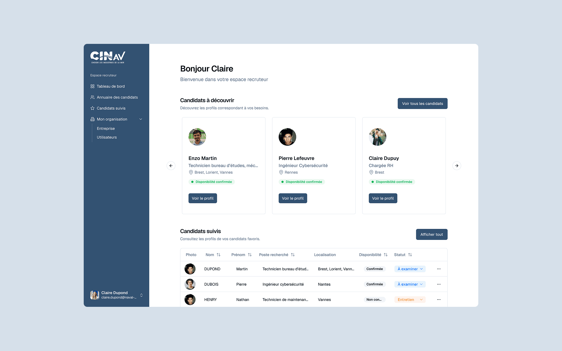
Once logged in, recruiters land on a personalised dashboard rather than a plain directory. The first profiles they see match the criteria they gave at sign-up, which cuts the time it takes to find relevant candidates.
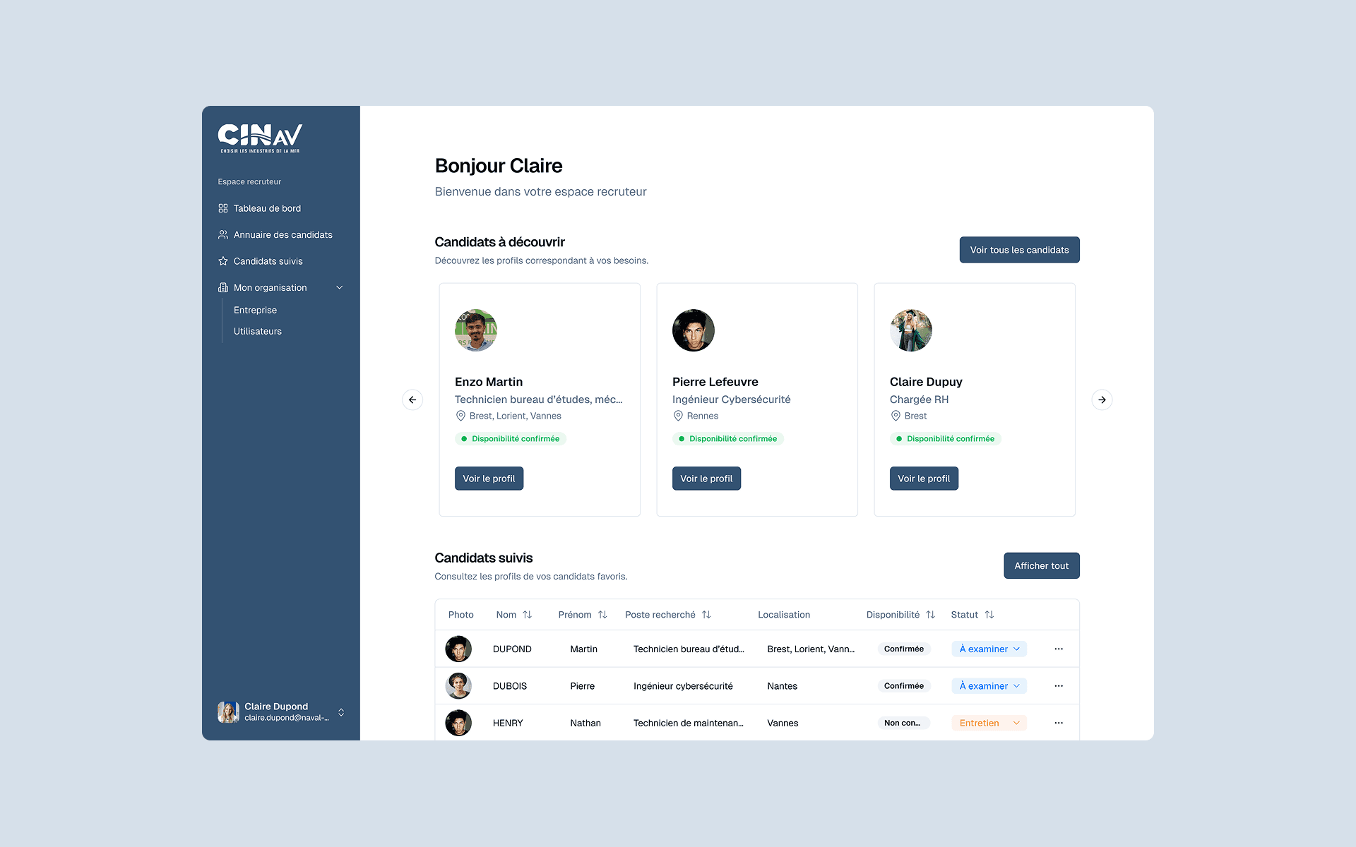
The whole pool stays reachable through search and a set of filters - trade, location and so on.
Each candidate file gathers what a decision needs: identity, target role, location and uploaded documents.
To help track hiring, I added a few essentials: favourites, internal notes and status labels (To review, Interview, Rejected, Hired).
The point was not to rebuild a full applicant tracking system, but to give recruiters what they need to organise their work without inflating the product.
Keeping the talent pool genuinely current
Another problem surfaced quickly: how do you stop the pool going stale?
A candidate might find a job days after creating their profile. Without regular updates, recruiters end up contacting people who are no longer available.
With the client, we settled on a simple mechanism: ask candidates at regular intervals to confirm they are still looking.
Every five days, a notification lets them confirm their availability in a couple of clicks. It asks very little of candidates while making the pool far more reliable.
Results
The product met the client's expectations. The platform is live and in use by several companies in the industry.
The tight MVP scope held: the next iterations can build on real usage rather than assumptions.